Relating to the previous brief we are tasked to create imaginative yet practical packaging design for either the same company or a different idea.
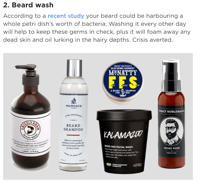
I chose to continue with my previous beard company and through research I found there are copious amounts of products intended for beards/barbershops
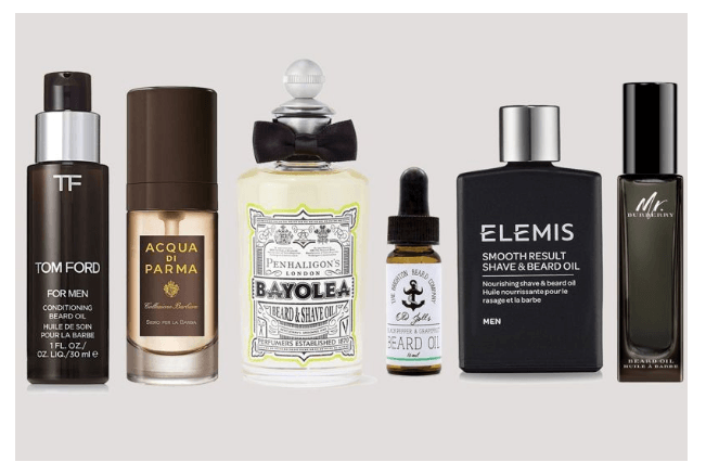
The similarities in these products are that they are plain, simple yet they get the message across. I also noticed the colours were quite dark, as I looked around I saw on colour psychology a chart which shows what colours men prefer;
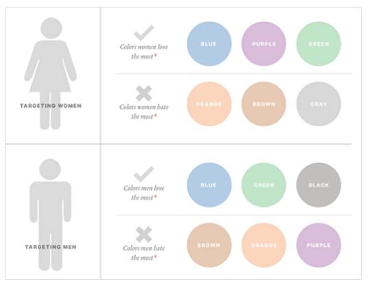
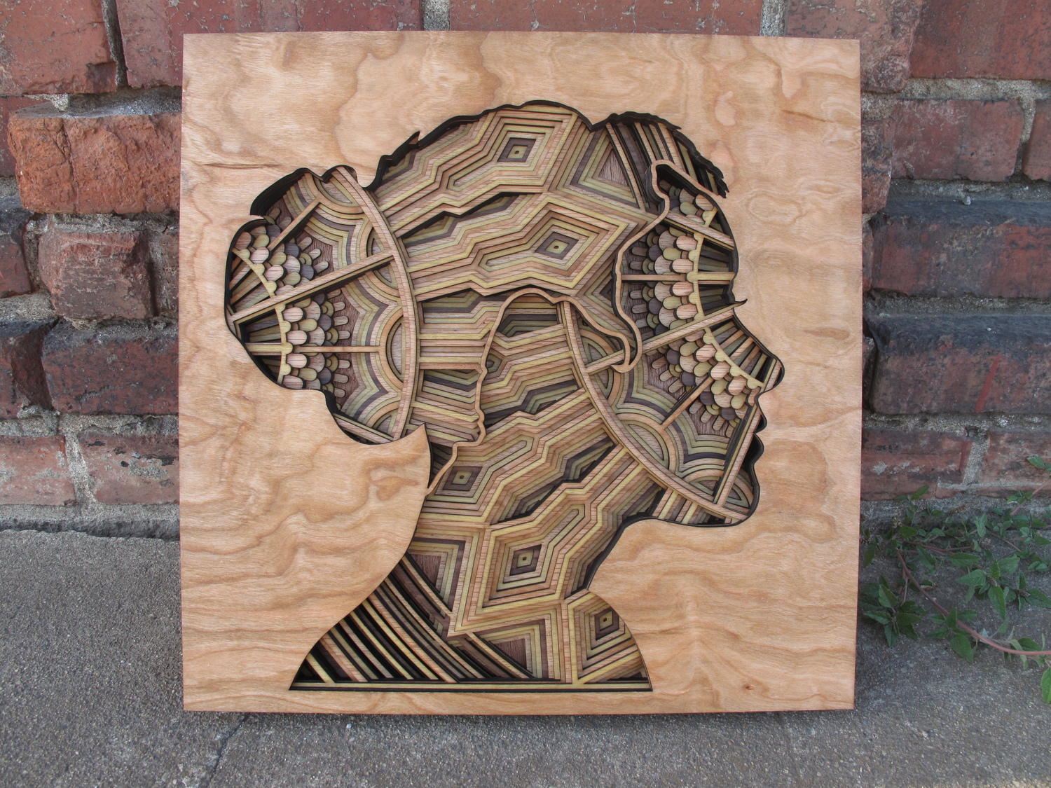
Men prefer blues, greens and blacks – my logo was mainly brown which is dark however I edited it to create a dark charcoal effect to match my simple black and white packaging- I was slightly inspired by wood cutting art where artistics would cut into wood using lasers to create a picture but it’s lightly inspired like that- as I began experimenting with photoshop effects I felt the charcoal effect was extremely appeal and sticks to my idea of minimalism.
After editing my main logo I began placing them on possible mockups a barber shop would have such as:
Cosmetics
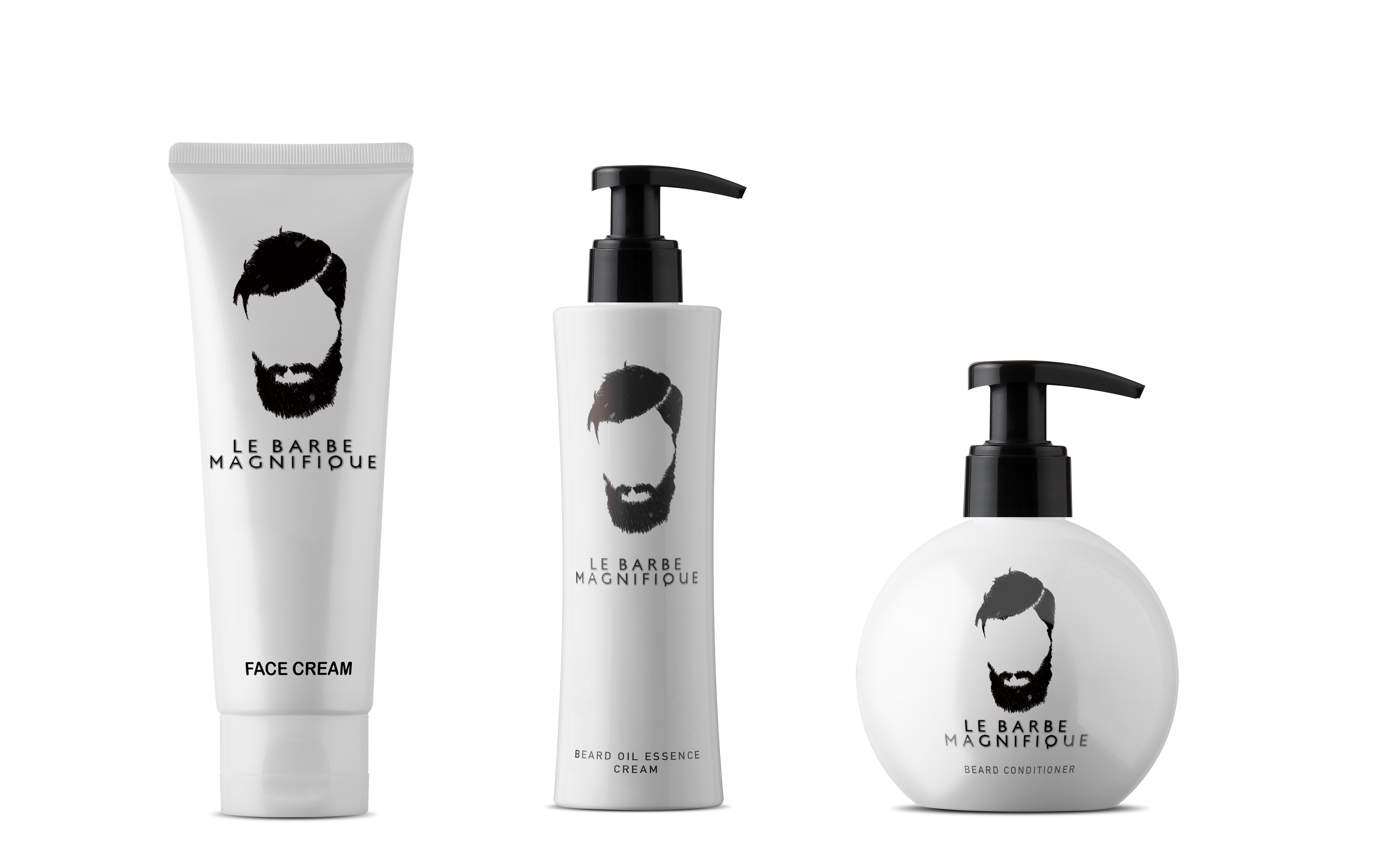
It went well placing the logo as well as the writing on the products, I paired it with the font Geneva and Arial Bold so it kept it the clean cut image.
Hanging wall sign
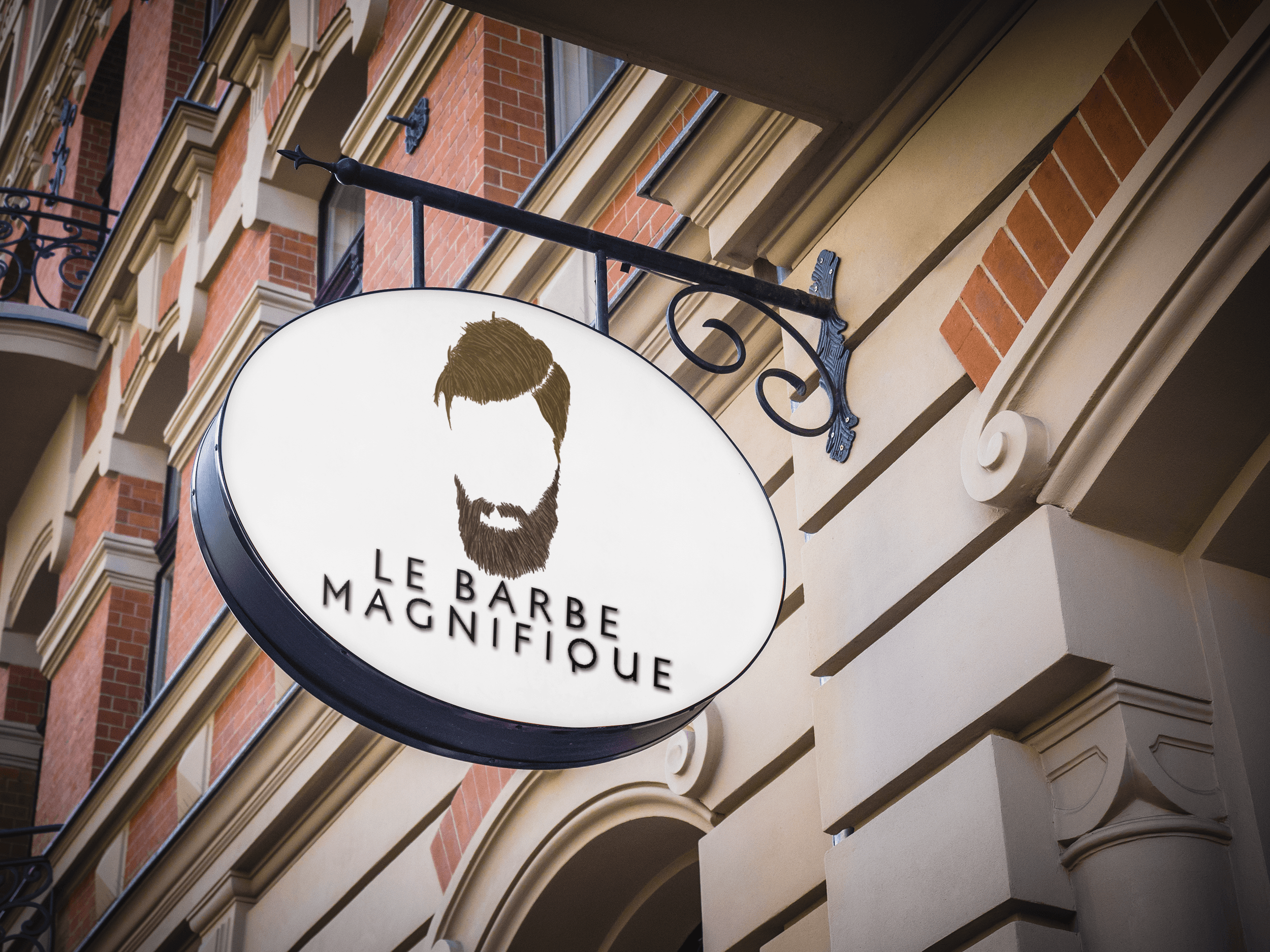
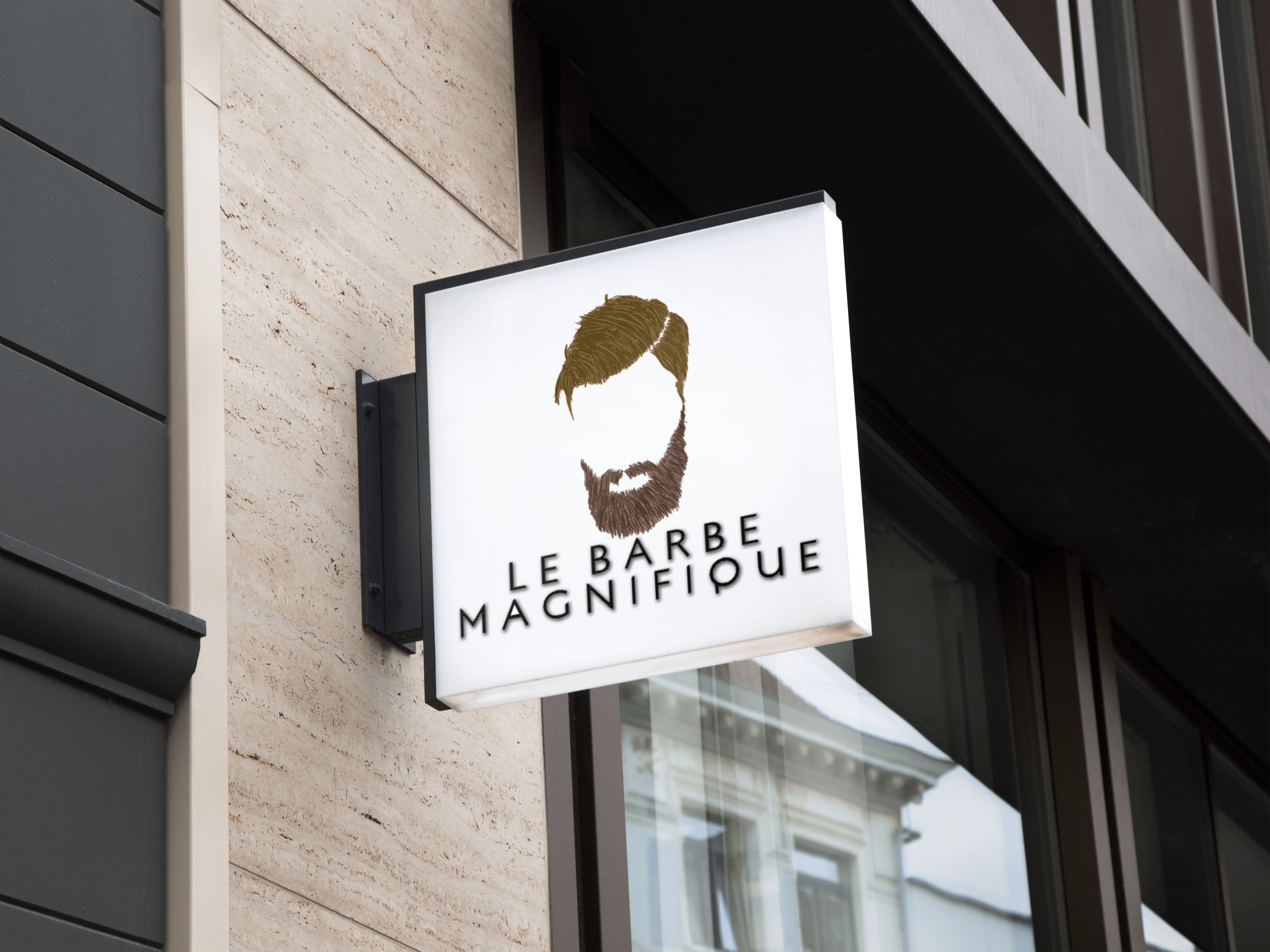
My idea design for the logo paired really well as a hanging wall sign which makes me happy as my intention was that from a distance the logo is recognisable and the font would be easy to read it’s extremely effective on a white background so an improvement would be to essentially change the tones/adjust it for a black background.
Shirts
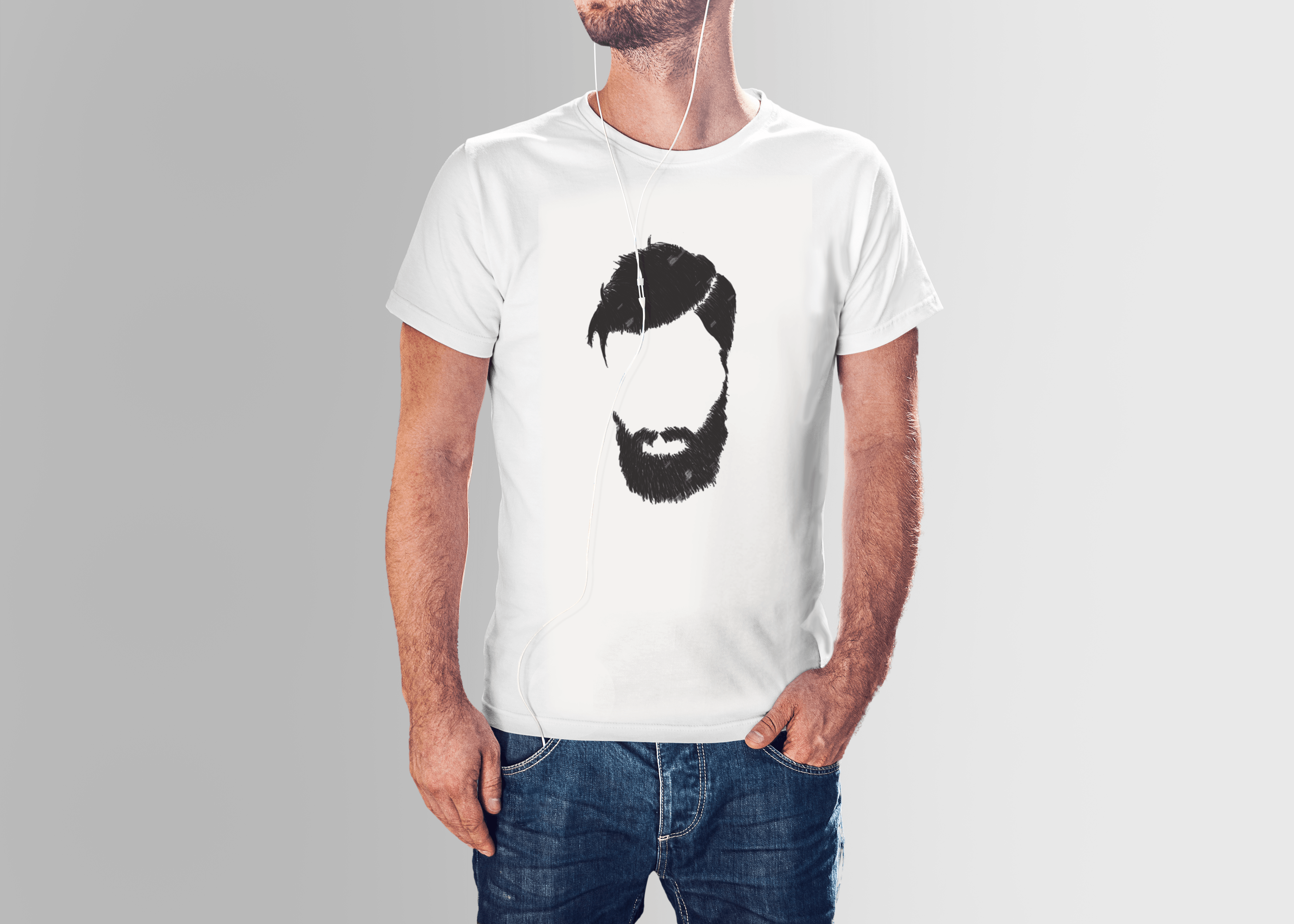

I went a little overboard on product mockups however I felt shirts were a good idea for essentially staff to wear or if the company was viral shirts would be sold, I used both designs to allow variety one where you recognise the company through the image and one which clearly states it.
Website
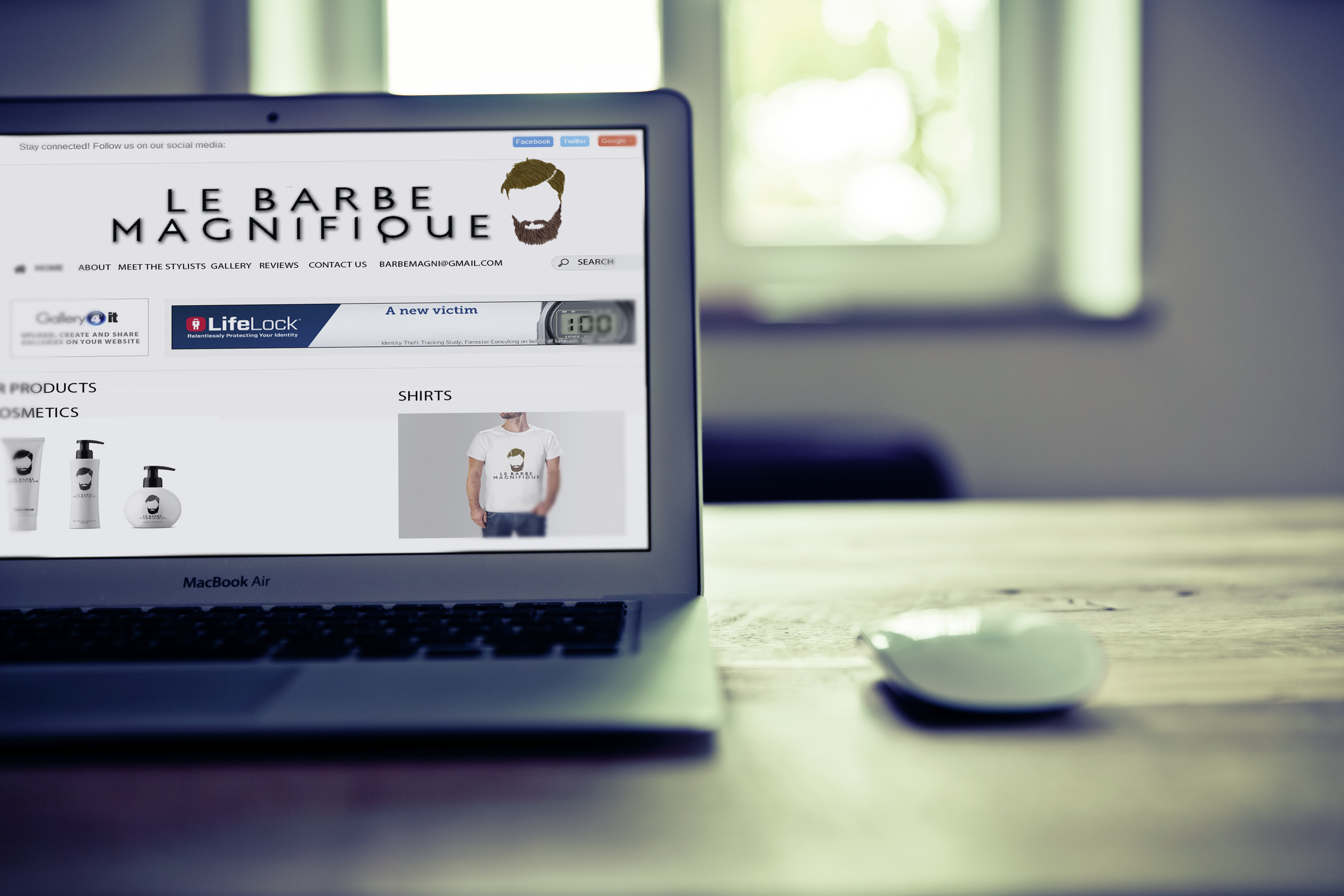
The power of good design states: “When commissioning a design company to promote your brand and website, think in simple terms and don’t try to put absolutely every single piece of information about your company on your ‘Home’ page. Remember facts that you may find absolutely fascinating might bore your potential audience to tears.” (GEL Studios, 2017) So when I created a website layout I considered colour psychology as well as the power of good design, I used the white to bring out the rest of the images which included the products and logo and it worked really well- it stays simplistic yet tasteful and it’s easy to navigate.
Image from: https://blog.kissmetrics.com/how-colors-affect-conversions/
Bibliography
Carvell, N. (2017). The beard products you need for the best facial hair of your life. [online] British GQ. Available at: http://www.gq-magazine.co.uk/article/best-beard-products [Accessed 17 Apr. 2017].
Anon, (2017). How to Use the Psychology of Color to Increase Website Conversions. [online] Available at: https://blog.kissmetrics.com/psychology-of-color-and-conversions/ [Accessed 18 Apr. 2017].
Schama, G. (n.d.). [image].
GEL Studios. (2017). The Power of Good Design. [online] Available at: https://www.gelstudios.co.uk/blog/2015/08/17/the-power-of-good-design/ [Accessed 18 Apr. 2017].