Identity: Choose from 6 fictional companies and create an identity package which accurately represents the client- taking into consideration audience, design trends, profiles etc.
I personally chose the company, ‘Le Barbe Magnifique’ – my research didn’t necessarily stick to looking at logo’s specifically for barber shops as I look at hairdresser signs as they’re quite similar businesses. The TONI&GUY
logo was a small part of my inspiration as I liked how simple it was as well as the font, specifically the ‘hairdressing’ part as I liked how slim and refined it looked. I also similarly looked at Daniel Granger’s (another hairdresser, who is based in Northampton) website. This lead me to think about font ( I realise it’s backwards as I should focus on the logo), looking through dafont.com I decided on a sans serif font, minimalistic and clean cut. I made these choices as there was a certain look I had for my logo, choose such a font also meant it would be easy to read and compliments the picture/logo when it’s created. I came across five options;
– option one: Sans Serif Plus 7
– option two: Light Sans Serif 7
– option three: Minimal
– option four: Caviar Dreams
– option five: Basic Title
I eliminated the first two because Sans Serif 7 Plus gave me more of a futuristic feel due to the ‘s’ being quite blocky in a sense, it didn’t look appropriate to sell/portray a barber’s as I wanted to give it more of a hipster look. As for Light Sans Serif 7 again it didn’t look appropriate as the letters themselves were too too curvy yet some parts were too straight- it didn’t mesh well and it wasn’t the font that would work well with my idea.
I was extremely torn by the last three options as looking through DaFont these three really stood out as they would compliment my idea well, they’re also easy to read and easy on the eyes- I removed Caviar Dreams because I felt some of the letters were either too thin or slanted and I wanted the text to be evenly spaced, a nice straight font.
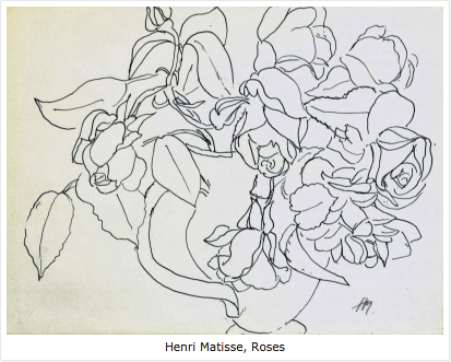
As I began to think about my logo, I looked at artists who digitally draw which made me noticed most of their drawings began with lineart- this inspired me to do some lineart of my own and possibly use it for my logo due to how simplistic yet refined it could turn out this also lead me to research lineart where I found famous art pieces by David Hockney as well as Henry Matisse,
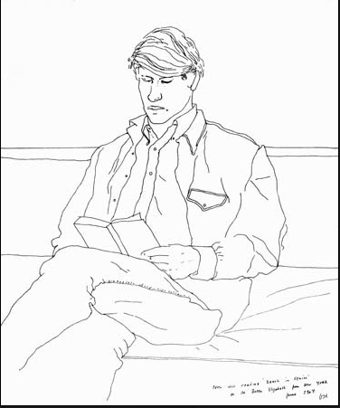
David Hockey
I had the idea of using my flatmates who had beards and a well known model, Chris Millington (famous for his edgy style and cool beard) to be the face of my logo which I drew out and included the font:
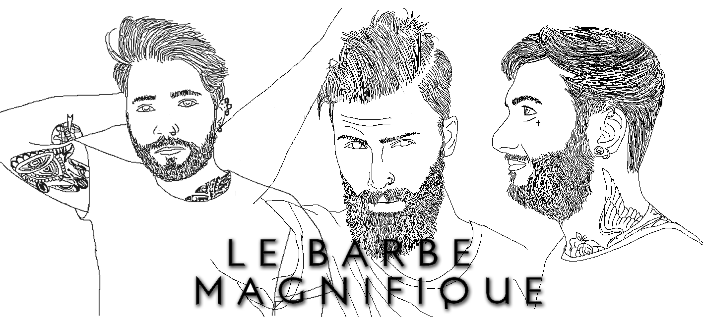
I was really happy with the results, I even edited in some tattoos on the men (left side and right side) and it really fits the edgy, minimalist image however I felt it was a little plain and simple. So I began looking at other barber shop logos which had colour, mostly block colours which stand out and can easily spotted from a distance, whether its a hanging sign, business card or anything else. Having three of them as a logo was a little crowded so I used Chris Millington (drawing in the middle) as a point of focus;
![]()
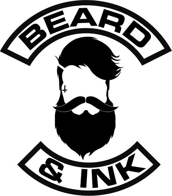
Again this felt too plain and simple as I want the main focus to be the beard, so I began looking around for beard logos and stumbled across a few which stood out
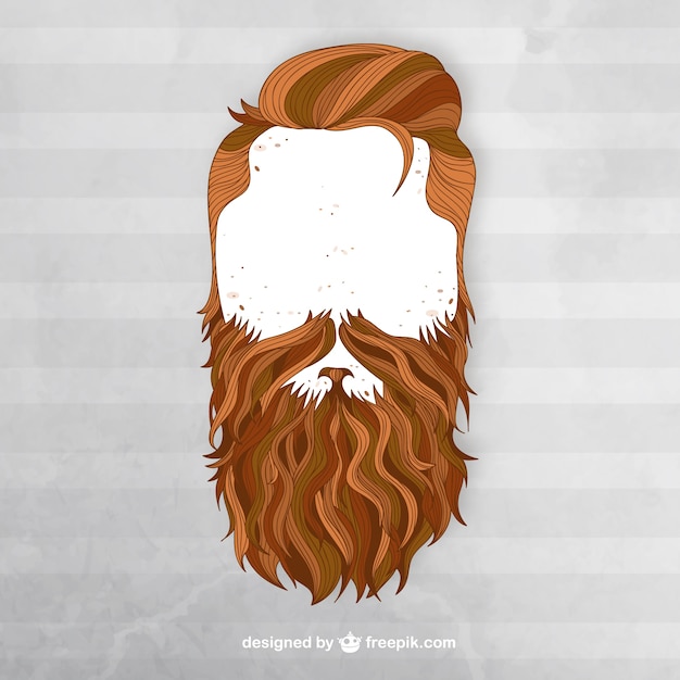

After looking at these pictures, I attempted to colour in the beard of the lineart using my tablet to create small stroke so it had the effect of a real beard and each fine hair, afterwards I removed the lineart to expose just the drawing of the beard and it worked really well which led me to add different tones into the beard and use it as a logo, the results were such:
![]()
This was my end result which I think turned out really well because the beard itself is the main selling point and it’s really recognisable- I’m really happy with the colours I used because they compliment each other really well making the logo itself look realistic. It feels like the logo itself could be iconic as those who are fans of Chris Millington would recognise him- or those who are beard fanatics/ love their beards and take good care of it. It’s minimalistic yet refined which was my main aim.
An improvement I would make, however would be that I should’ve experimented with colour more so that the beard/hair combo stood out more. But all in all visually it came out how I intended.
Bibliography
(Toniandguy.sg, 2017)
Berlindrawingroom.blogspot.co.uk. (2017). Contour Lines from Matisse to David Hockney. [online] Available at: http://berlindrawingroom.blogspot.co.uk/2014/01/contour-lines-from-matisse-to-david.html [Accessed 19 Apr. 2017].
Dafont.com. (2017). DaFont – Download fonts. [online] Available at: http://www.dafont.com/ [Accessed 16 Apr. 2017].
“Home”. Daniel Granger Hairdressing. N.p., 2017. Web. 22 Apr. 2017.
Behance.net. (2017). Santana Barber Shop Logo. [online] Available at: https://www.behance.net/gallery/28072439/SANTANA-BARBER-SHOP-LOGO [Accessed 20 Apr. 2017].
desamba, y. (2017). Collection of Inspiring Barber Shop Logo Designs | Jayce-o-Yesta. [online] Jayce-o-Yesta. Available at: http://jayce-o.blogspot.com/2013/02/inspiring-barber-shop-logo-designs.html [Accessed 19 Apr. 2017].
Ink, B. and Ink, B. (2017). Home. [online] Beard And Ink. Available at: http://www.beardandink.com/ [Accessed 19 Apr. 2017].
Freepik. (2017). Beard Vectors, Photos and PSD files | Free Download. [online] Available at: http://www.freepik.com/free-photos-vectors/beard [Accessed 25 Apr. 2017].